Visual Communication: Aesthetic and Technical Guide to Image Message Sharing
Visual Communication: The Aesthetic Revolution Beyond Text
Evolutionarily, the human brain has the capacity to process visuals 60,000 times faster than text. In the age of digital communication, this biological reality explains why image messages have become so dominant. When a celebration, a sorrow, or a motivational quote is combined with an aesthetic visual, it is no longer just a message but turns into a digital work of art. In academic communication studies, this is called 'Multimodal Communication,' which is the process of sound, image, and text combining to create a richer layer of meaning. Sharing an image message is not just saying the emotion, but also showing it.
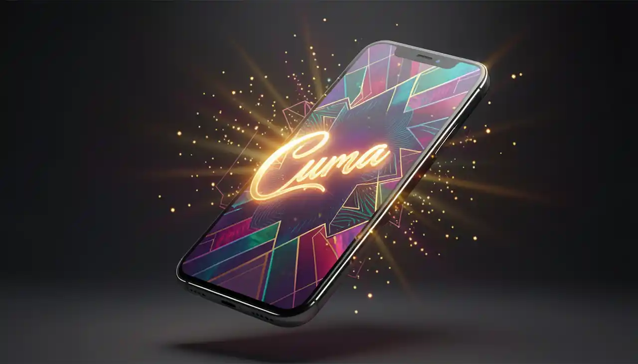
Color Psychology and Emotional Toning
The color palette used when designing or choosing a visual message sends direct signals to the recipient's subconscious. For example, pastel tones and soft transitions provide peace and trust, while vibrant yellows and oranges instill energy and joy. Ensuring chromatic harmony (color balance) in special day greetings determines the seriousness and quality of the message. While gold-leafed details represent a traditional and heavy atmosphere, minimalist white backgrounds reflect a modern and clear mindset. Colors activate the emotional decision-making mechanism in that first second when the words have not yet been read.
Typography: Giving Character to Words
The typefaces (fonts) used in image messages are the 'tone of voice' of the text. Serif fonts whisper reliability and tradition, while modern sans-serif fonts give a message of clarity and speed. Handwritten fonts used in a love message increase sincerity and personality, while thick and upright characters used in a success message symbolize authority. Typographic hierarchy; that is, writing the main quote large and additional information or the signature small, ensures the eye scans the visual in the correct order. The wrong font choice can destroy the impact of even the world's most beautiful quote.
Format Optimization According to Social Media Platforms
The success of an image message is also related to how compatible it is with the technical dynamics of the platform where it is shared. While 1:1 square or 9:16 'Story' formats are ideal for Instagram, vertical compositions are more impressive in WhatsApp status shares. Visual resolution, namely the clarity of the text and the background, is indispensable for a professional stance. Blurry or pixelated visuals reduce the value of the message, creating an impression of 'sloppiness.' Shares made by paying attention to each platform's unique 'safe zone' rules prevent the text from being squeezed to the edges of the screen and increase reading comfort.
Composite Meaning: Harmony of Text and Background
The most critical component of an image message is the semantic correlation between the text and the chosen image. A quote themed 'peace' written over a seascape creates semantic integrity. However, the contrast between text and visual should only be used when a conscious 'irony' is intended. In terms of academic semiotics, the symbolic meanings of the objects in the background (for example, candlelight representing hope, a compass representing guidance) add a metaphoric depth to the text. The background serves as a decor that stages the main idea within the text.
Sharing Ethics and Copyright Awareness
When sharing visuals in the digital world, issues of 'copyright' and 'content originality' are ethical responsibilities. Citing the source when sharing someone else's design or utilizing high-quality licensed content pools is a requirement of digital courtesy. Furthermore, instead of bombarding group chats with visuals, sharing at personalized and meaningful frequencies is important for digital communication ethics. Originality is the greatest source of prestige. Choosing non-generic visuals that best reflect your own feelings will separate you from the digital noise.
Personalization: Leaving the Digital Signature
A small name tag or date added onto a ready-made image card turns that visual from a 'mass-produced' object into a 'special gift.' Modern design tools allow users to make such modifications on ready-made templates. Personalized visuals maximize the emotional bond by creating a feeling of 'thought for me and prepared for me' in the recipient. In the digital age, the scarcest resources are 'attention' and 'care'; every small detail you add to your image message is the most concrete proof of this care.
Conclusion: Leaving a Trace with the Power of Visual Language
In conclusion, image message sharing is not just a 'trend,' but a part of the visualization journey of human communication. A visual prepared with the right color, the right font, and the right meaning match can achieve an impact in one second that thousands of words cannot. By following the aesthetic and technical rules in this guide, you can leave unforgettable and elegant traces on the digital screens of your loved ones. Remember that what the eye sees guides what the heart feels. Now is the time to choose the most beautiful visual that will shed light on your words and scream your love to the world with colors.
Ready-to-Use Text and Image Messages: 21 Categories — Experience This Now
Download our app to explore all these features and more.