Eye-Friendly Quran Reading: Digital Ergonomics and Visual Comfort Analysis
User Comfort: The Importance of Visual Ergonomics in Digital Recitation
The act of reading the Holy Quran is a process that requires a high level of visual focus and attention. Bringing the traditional Mushaf aesthetics to digital screens is not just a format change; it is also a matter of 'ergonomics.' From an academic perspective, the readability of a digital text depends on the balance of factors such as background color, font design, and light intensity. A poorly designed digital environment can create 'digital eye strain,' shortening the reader's focus duration and dispersing their spiritual intensity. Eye-friendly themes are aesthetic shields that place technology at the service of worship.
Night Mode: Melatonin Protection and the Aesthetics of Darkness
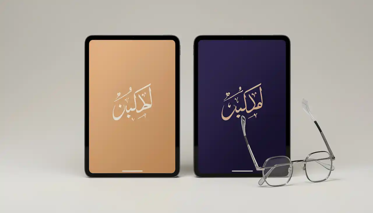
In environments where light is insufficient or in readings done before sleep, 'Night Mode' (dark mode) is a biological necessity. High-energy 'blue light' emitted from digital screens suppresses melatonin secretion in the brain, disrupting sleep patterns. Academic studies show that using light-colored text on a dark background reduces light sensitivity and relaxes the eye muscles. Preferred themes in dark blue, anthracite, or black while reading the Quran allow the luminous Arabic calligraphy in the text to become more prominent. Darkness is the most faithful friend of focus; it prepares the ground for the soul to reach tranquility.
Sepia and Parchment Themes: The Traditional Mushaf Feel
Eye health experts emphasize that very bright white screens tire the eye by creating a 'snow reflection' effect. At this point, 'Sepia' or 'Antique Paper' themes bring the warmth of traditional handwritten Mushafs to the digital screen. Soft yellow and cream tones minimize the amount of light reflection (glare), creating the most ideal 'academic comfort' zone for long-duration readings. Psychologically, these colors create a sense of 'peace and serenity' in the reader. This harmony of traditional aesthetics with modern technology transforms digital recitation from a mechanical act into a radiant art experience.
Typography and Font Selection: The Readability Coefficient
The unique curves and harakat (vowels) of the Arabic script can blur together in low-resolution or complex fonts. For an academic-level Quran reading experience, 'Legibility' comes before everything. Digital fonts based on the classic Naskh script, which do not tire the eye and where letters and vowels can be clearly distinguished, reduce the margin of error to zero. The ability for the user to adjust the font size provides accessibility for individuals with different visual abilities. Words should be lined up like pearls on the screen; the eye should glide between letters without fatigue.

Light Intensity (Brightness) and Contrast Balance
The most technical detail of reading comfort is the balance between screen brightness and ambient light. Looking at a very bright tablet screen in a very dark room increases eye fatigue by 40%. Modern digital assistants offer 'smart contrast' features to provide this balance. It is academically recommended to keep the contrast between text and background in the 70-80% range. Using a very dark gray background instead of absolute black prevents the 'halo effect' of letters, thereby increasing reading speed and comprehension quality. Light should only enable vision; it should not distract attention.
UX Design: A Simple Interface for Spiritual Focus
When reading the Quran in a digital environment, flashing advertisements on the edges of the screen or complex menus are the biggest parasites disrupting the mind's 'flow' state. Academic User Experience (UX) design rules mandate the use of a 'minimalist and clean interface' in content requiring spiritual focus. A 'full-screen reading mode' where only the verse and translation are present, and all toolbars can be hidden, isolates the mind from the outside world. Simplicity is the most elegant garment of spirituality. Design should serve as a bridge to remove obstacles between the reader and the divine word.
Eye Gymnastics and Digital Reading Discipline
Even if the best theme and font settings are made, the '20-20-20 rule' (looking 20 feet away for 20 seconds every 20 minutes) should not be neglected during long-duration digital readings. Protecting the health of the eye muscles is an academic necessity for the continuity of worship. The individual reading the Quran in a digital environment should combine this technical discipline with their spiritual discipline. Eye-friendly themes are 'auxiliary units' that facilitate this process. Care shown for eye health is actually a manifestation of respect for the body and appreciating the provided blessing. Health is the capital of a luminous life.
Conclusion: The Spiritual Meeting of Aesthetics and Comfort
In conclusion, eye-friendly Quran reading themes are not just technical options; they are aesthetic decisions that determine the quality, duration, and depth of worship. By choosing the color palette and font most suitable for you, you can transform your digital screen into radiant Mushaf pages. Every recitation performed with the right light, the right font, and the right theme will prevent mental fatigue and open more space for heartfelt reflection. Remember that the beautiful enables one to see beauty better. Now prepare the most peaceful reading environment for yourself and embark on a radiant journey in the infinite light of the verses, without your eyes getting tired.
Holy Quran & Meaning: Digital Translation Guide — Experience This Now
Download our app to explore all these features and more.